Frankie Johnson
Finally get off the rollercoaster of offering #allthethings by uncovering your true potential
Grab your freebie!
Blog Categories
Marshmallow biscuit topping sugar plum cookie topping sweet carrot cake chupa chups.
Hi, I'm Frankie! The girl who fell in love with business.
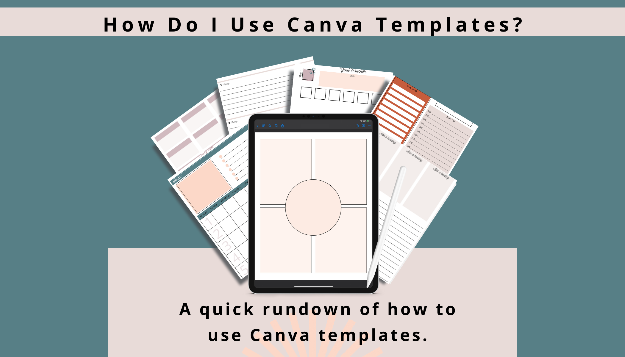
How Do I Use Canva Templates?
Use a Canva template by clicking on the provided link and importing into your own account.
Canva is a beginner’s dream when it comes to quick and simple graphic design projects. You don’t need experience if you want to create a professional design, when you decide to use Canva’s templates.
Today I’m going to give you a quick rundown of how to use Canva templates, including adjusting the font, choosing a layout, using Canva photos, and uploading your own.
I’ll even show you how to use multiple templates on the same design.
All of these features are easy to do, so by the end of this article, you should be feeling confident in your new Canva skills!
What Are “Canva Templates”?
If you are completely lost, then let’s start with the basics. Canva is a graphic design company, and they give you premade templates that you can edit.
These templates could be book covers, poster ideas, advertisement suggestions, or even Instagram posts.
They can be for anything!
To create a template, go to your Canva account and click “Create A Design”. You will be automatically taken to the templates page. Click one of the templates which fit the type of design you are looking for.
Don’t worry if it doesn’t look the way you want it to, because at this point you’re just helping Canva figure out what you are trying to create.
What Should I Do First?
When you’ve clicked on the template you’ll be taken to an editing page. Notice that other suggestions for the same type of template have come up on the left-hand side.
For now, I suggest using these templates until you have more confidence in your creations. You’ll see that the templates are really good all by themselves, all you have to do is make them yours!
1. Pick a Layout
I suggest choosing the layout from the left-hand side, there are tons to choose from so keep scrolling until you find one that matches the essence of your graphic idea.
2. Changing the Font
Canva has 50 free fonts for you to choose from, so the world is your oyster! If you are a Canva Pro user, then you can use the ones in yellow for free. If you aren’t then you’ll have to pay a $1 fee to use this font, and you’ll have to pay it each time you want to use it.
This might be a problem if you are a free user and want to use the yellow-marked font because a business should really be using the same font on all of their work. This creates a sense of consistency and familiarity for your customers.
If you really want that yellow-marked font, I suggest going pro for less than $10 a month.

3. Uploading your Own Photo
After customizing your font, you might decide to use your own photo in the design as well. Simply click the upload button, then you’ll find your photo in your folder.
Drag the picture from your Canva folder onto the template and hey presto, your photo is uploaded.
If you want to change the photo but don’t have one of your own to choose from, then you can use Canva’s stock photos. Click the “photos” button, and then in the search bar type the description you are going for.
For example, you could put “Travel”, “Plane”, “Beach”, “Suitcase” if you were creating a graphic design for a holiday resort.
Some of the photos in Canva’s photo library do cost money, but if you want to look at just the free options, then click the “Free” button in the search bar.
What that does is filter out any of the photos you have to pay for, so you don’t get your heart set on an image you can’t afford.
Once you’ve picked the one that you want, drag it into the template frame!
4. Adjusting The Layout
Now you have the right background photo, the right font, and hopefully, you’ve already put the right words into the textbox, so it’s time to organize the design.
I normally put text in the negative space to create a dynamic feel to my Canva work, but depending on what you’ve chosen that might not work for you.
Move the text around to see where everything should go. You’ll notice as you move the textbox that guidelines will appear around your items. This is to help you keep the work straight or in line with your other texts.
If you want the photo to have a filter, all you need to do is click on the photo itself. When you do that the left-hand side will show you a bunch of different editing options as well as an intensity bar so you can adjust it to your liking.
There are 20 filters to choose from, so play around until the image looks perfect.
How To Use Multiple Templates in Canva?
You may have noticed at this point that there are a couple of templates that you’d like to use. You use a different template on the same design by clicking on the “+” button at the corner of the screen which will bring you to a drop-down menu.
Click on “Page” which will add a new page for you. And then you can drag a different template onto the page, allowing you to use multiple templates at once!
How To Publish Using Canva?
Once you’re ready, you can download your design onto a hard drive, into an email, or even post it directly onto social media. I suggest that you save your design first so you can reuse, reference, or be inspired by it on another day.
You can even use the same layout or filters to create the continuous and familiar feeling I was talking about earlier.
In the top right-hand corner, there is a button that says “download”, and another which says “share”. Depending on where you want your graphic art to go, click the button which makes sense to you, and hey presto your art is completed!
Macaroon gummies sweet roll tiramisu caramels cake chupa chups. Topping gummies dessert. Candy biscuit topping jujubes chocolate biscuit. Chocolate cake jelly beans.
custom journey mapping
Macaroon gummies sweet roll tiramisu caramels cake chupa chups. Topping gummies dessert. Candy biscuit topping jujubes chocolate biscuit. Chocolate cake jelly beans.
business budgeting
Featured Masterclasses:
Here's your FREE pass!
|
© 2021 [your business name]
